11/22/10
Sony and their mysterious ink. An astute reader named Joe (from parts unknown) pointed out that I’d missed something in the Sony DT 35mm F/1.8 SAM review. Apparently, Sony’s new “easy choice” lenses are being given the full, high dollar pearlescent ink treatment, which looks great when viewed under a microscope. Unfortunately, I don’t think most people will be doing that, so I’m speculating that Sony is not properly marketing this feature. Of course, I don’t know much about marketing in general, so I could be missing something important.
The top photo (below) shows the sparkly paint/ink that is used on both the 35/18 and 85/28, but only on the lens name, focus distance meters scale, and the Sony name on the side. The AF/MF is non-sparkly standard white, and the orange numbers are not sparkly either.
I checked the DT 30mm macro, and that lens has no sparkly paint/ink, or whatever is used, so apparently it’s new to the “easy choice” lenses for some reason. Could it be that Sony is using this type of paint/ink as a quick way to try and identify the product authenticity and/or origin? Does this apply to the global market, or only in the US? Owner’s of these lenses in other markets might want to check your copies out just for fun and let me know if they’re different. Why would Sony change the type of ink used (standard white), when nobody will notice the difference when viewing the lens during normal handling? The sparkly stuff is only visible when you’re trying to look for it with a strong light and a magnifying glass.
The photos below of the Sony DT 35mm F/1.8 SAM numbers and letters where taken with the sony 100mm macro lens, with the same light at the same angle. The black background looks like a deep field image from the Hubble for some reason, and is not dust.
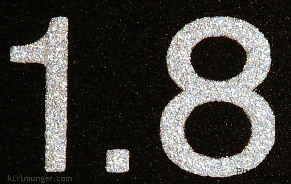 |
| Detail of Sony DT 35mm F/1.8 SAM lens numbers |
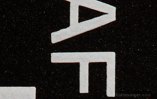 |
| Detail of Sony DT 35mm F/1.8 SAM AF/MF lettering |