I’ve whipped up a quick review of the X-rite ColorChecker. This little 8.25″ x 11″ (210mm x 280mm) laminated (back part only, don’t touch color patches) chart is handy if you want to get your picture colors close to what they were at the scene originally, and have no white references to go by inside the image, like wall switches, towels or trim moldings etc. I use the color checker in addition to visually evaluating the color of each final image I present to a client, because I have the time to do this, and I set the proper white balance at the scene, so I know I’ve got the colors close at the time of capture. For cheapskates and amateurs; use a white piece of paper and shoot in RAW, and eyeball the final color, that’s all you need to do, and it usually works fine. Do note; if you shoot in jpeg and mess up the colors at the location, you probably won’t be able to fully correct color problems. Most people (and cameras in auto WB) shoot low-light incandescent lighting too warm, and you wind up with a yellow or orange picture. In jpeg, you can usually balance the colors in post processing to get them to be more accurate, but if you’re off too far, you’ve blown the image, that’s why it’s wise to shoot in RAW.
If you’re doing technical work, studio photography or producing large amounts of images that need consistent and accurate colors, with automation, you can check out some color management applications. I won’t cover that here. There’s plenty of info available online.
I’ve found the best use of the color checker is to be able to pacify clients that think the color of something in the image isn’t quite “right.” If you start to talk about white balance, reflectivity or luminance, they don’t understand, and think you’re trying to cover up poor technique. If you tell them (and show them) that you used a color checker, they won’t argue, because they don’t know how it ties in with the final image, but it looks professional. Doing this is not cheating, or short changing the client, you’re simply showing them you did check the colors, and know how to read the chart, and compensate to make sure the colors in the final image are as accurate as possible. I can do a good job by eye if I have a reference, but that’s not something I can show the client.
When people talk about the “right” colors for the image, they probably aren’t considering differences in viewing monitors (cheap laptops have awful screen colors) printers, saturation, paint reflectivity, like glossy paint in the kitchen being a little different from flat paint in the living room, even though it’s the same color, or the incandescent lighting in the bathroom, which looks fine when left warm, but some may say it looks too yellow. It all depends on personal preference, that’s why it’s not a good idea to spend too much time on getting the colors “right.”

The X-rite ColorChecker comes in a handy sleeve with a plastic cover and instructions. There’s a guide to the color patches on the back of the chart itself, and in the instructions. It includes helpful information such as; if the no. 13 blue patch turns a little purple, there’s too much red in the lighting. If the yellow-green no. 11, and blue-green no. 6 patch will reverse if there are problems with the blues or yellows. You also get a chart with numerical RGB and CIE L*a*b values, that’s useless for most people.
The following is from the X-ritephoto.com website.
The ColorChecker® 24 Patch Classic target is an array of 24 scientifically prepared natural, chromatic, primary and gray scale colored squares in a wide range of colors. Many of the squares represent natural objects, such as human skin, foliage and blue sky. Since they exemplify the color of their counterparts and reflect light the same way in all parts of the visible spectrum, the squares will match the colors of representative sample natural objects under any illumination, and with any color reproduction process. ColorChecker Classic can also be used to create a white balance with your digital camera to guarantee precise, uniform, neutral white under any lighting condition.
To compare digital reproductions to real life scenes or test targets, simply include ColorChecker in your first photo if you’re shooting JPEG or traditional, or any photo in the series if you’re shooting RAW. Later, in the studio, use it to compare, measure and analyze differences in color reproduction in any color rendition system. This objective standard will help you avoid costly mistakes and trial-and-error color correction after the fact.
The ColorChecker Classic can be used for a variety of applications, including:
- Digital Photography: Check images, correct white balance and perform color correction.
- Traditional Photography: Check films, lights, filters and paper
- Graphic Arts: Check any printing or proofing process
- Cinematography (Television and Video): Check cameras, lights and film
The ColorChecker is available in two sizes: Classic (8.25 x 11 in.) and Mini (2.25 x 3.25 in). Keep one at the studio, and tuck the other in your pocket for location shoots. If you’d like to create color profiles for your digital camera and take your digital photography to the next level, consider the ColorChecker Classic.
The Mini ColorChecker is not very useful unless it’s placed very close the camera.
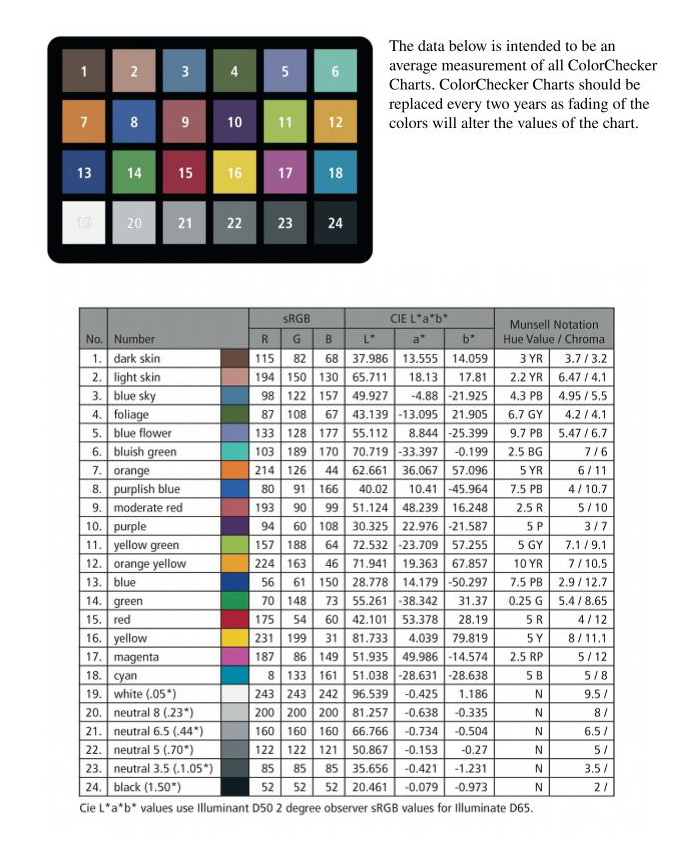
This is part of the instruction sheet with patch identities and numeric RGB values.
Let’s check out an actual scene.
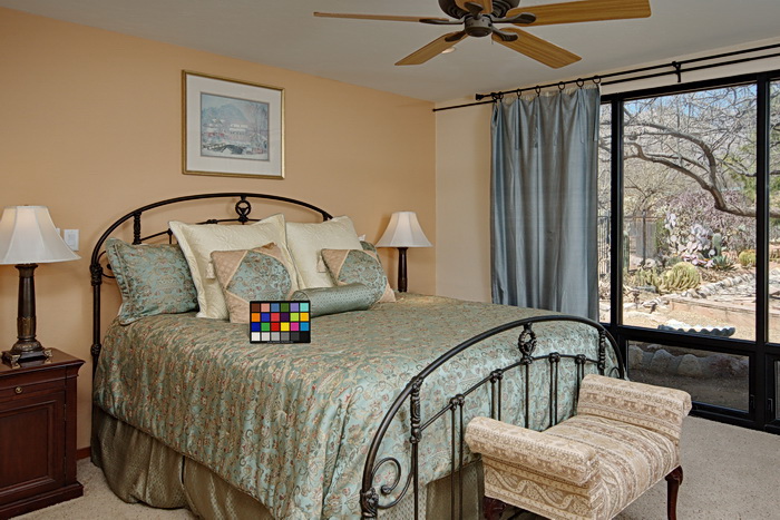
When you position the ColorChecker, make sure you have your lighting setup finalized, and the chart will not be susceptible to color casts from strong colors nearby, like putting it on a bright red bed-spread or comforter.
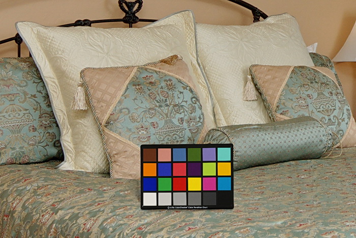
This is a close-up of the scene above. You can see the white patch is pretty white, and the no. 6 patch, top right, is bluish green, which is what it’s supposed to be, see the chart above. I’ve got the white balance pretty close here, although it’s slightly warm from the wall colors, and incandescent lighting.
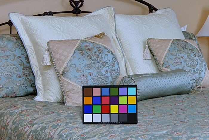
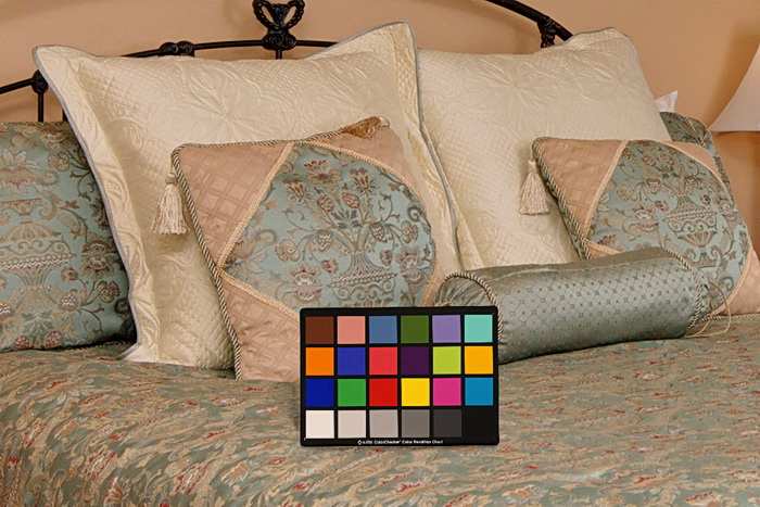
Let’s say you took this shot, and later at home you couldn’t remember if the pillows were white or tan. If you had something you knew was white inside the image, you could adjust it, but here I don’t see anything good to use. If you thought the pillows were white, this is what you’d get. It’s too blue, although the white patch looks white, the no. 6 patch is blue, and has no green, so we know the image needs to be warmed up some.
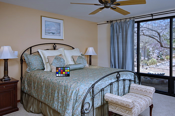
The whole scene of the crop shows some visual cues as to a white balance problem without looking at the chart. The outside lacks green from the cacti, and warmth from the normal stone ground cover. You have some white in the image, like the wall switch plate by the left lamp shade, and the picture matte, they’re both too blue looking to me, but this image might be just fine for someone else.
This image depicts what most people would probably get if they used the auto WB setting with the two bedside lamps on. The scene is too warm. The neutral (gray) patches are a little orange, and/or magenta is trimmed to hard, so we know this isn’t right.
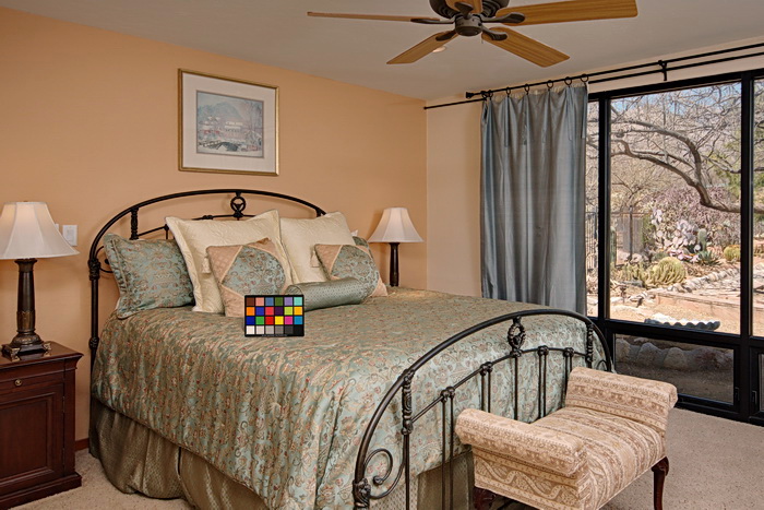
In the full scene, the outside colors don’t look too bad, but the room just looks too warm. Again, with the known white objects, like the wall switch plate by the left lampshade, and picture matte, you should be able to eyeball it to a more accurate color. Note; in the US, there are two switch plate colors used in about 95% of homes, either Ivory, which has been used for almost a century, and white, used for the past two decades or more. It’s pretty easy to tell the difference, even if you can’t remember what color they were. If you try to make an Ivory cover white, or vice-versa, the image will look like crap. Also, most ceilings are painted a flat white, but sometimes are the same as the wall color, which may be off-white or tan, like the right wall in the picture above, so don’t use the ceiling as a white reference unless you’re sure.
That’s it for the quick review of the X-rite ColorChecker.